MENU
カテゴリー
\気になるカテゴリーをクリック!/


Flutterでボタンの使い方を知りたい。
ElevatedButtonの使い方が分からない。
そこで、今回はFlutterのボタンにおける基本的な使い方をサンプルコードとアプリ画面で解説します。
フリーランスのFlutterエンジニアとして働きたい方にオススメのエージェントはこちらで詳しく解説しています。
初心者がFlutterで覚えておくべきボタンは以下の5つです。
以下のボタンはFlutter2.0から非推奨となり、新しいボタンに変わりましたのは要注意です。
| 古いボタン | 古いテーマ設定 | 新しいボタン | 新しいテーマ設定 |
|---|---|---|---|
| FlatButton | ButtonTheme | TextButton | TextButtonTheme |
| RaisedButton | ButtonTheme | ElevatedButton | ElevatedButtonTheme |
| OutlineButton | ButtonTheme | OutlinedButton | OutlinedButtonTheme |
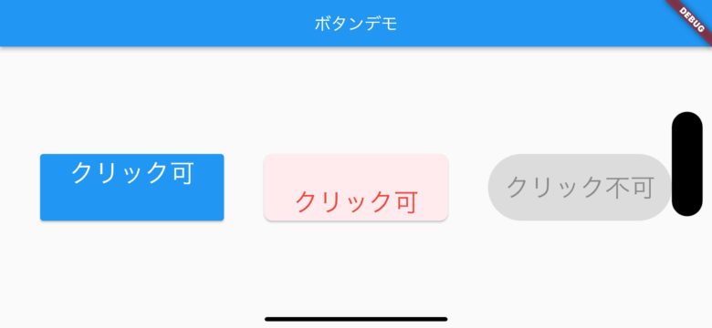
Flutterの基本ボタン1つ目はTextButtonです。名前の通りレイアウト上で表示されるのはテキストのみです。
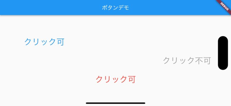
上記画面のTextButtonのサンプルコードは以下の通りです。
TextButton(
 onPressed: () {},
 child: Text("クリック可"),
 style: TextButton.styleFrom(
   textStyle: const TextStyle(fontSize: 30),
   foregroundColor: Colors.blue, // foreground
   fixedSize: Size(200, 200),
   alignment: Alignment.topCenter,
)),
TextButton(
 onPressed: () {
   print('赤クリック!');
 },
 child: Text("クリック可"),
 style: TextButton.styleFrom(
   textStyle: const TextStyle(fontSize: 30),
   foregroundColor: Colors.red, // foreground
   fixedSize: Size(200, 200),
   alignment: Alignment.bottomCenter,
)),
TextButton(
 onPressed: null,
 child: Text("クリック不可"),
 style: TextButton.styleFrom(
  textStyle: const TextStyle(fontSize: 30),
  foregroundColor: Colors.red, // foreground
  fixedSize: Size(200, 200),
)),
TextButtonで知っておきべきプロパティは以下の通りです。
| プロパティ | 指定 | 内容 |
|---|---|---|
| onPressed | 必須 | ボタンクリック時の処理 |
| child | 必須 | ボタンに表示するテキスト文字を指定 |
| textStyle | 任意 | テキスト文字のサイズ指定 |
| foregroundColor | 任意 | テキスト文字の色指定 |
| fixedSize | 任意 | テキストボタンのサイズ指定(横*縦) |
| alignment | 任意 | テキスト文字の位置を指定(上中央、下中央、上左寄り、など) |
TextButtonのデモ動画
上の動画を見ると分かりますが、onPressedでnullを指定するとボタンはクリックできません。また、クリックするとボタンサイズが大きくなっているのが分かります。
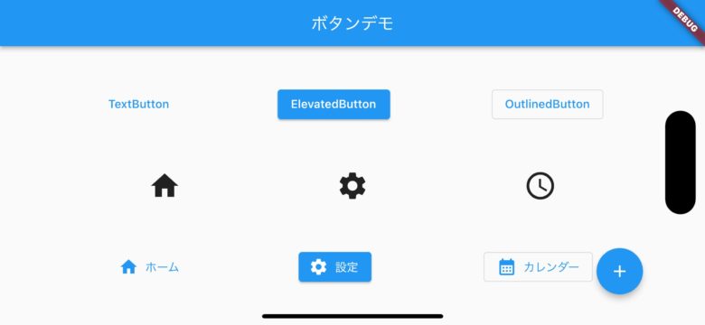
Flutterの基本ボタン2つ目はElevatedButtonです。
上記画面のElevatedButtonのサンプルコードは以下の通りです。
                ElevatedButton(
                    onPressed: () {},
                    child: Text("クリック可"),
                    style: TextButton.styleFrom(
                      textStyle: const TextStyle(fontSize: 30),
                      foregroundColor: Colors.white, // foreground
                      fixedSize: Size(220, 80),
                      alignment: Alignment.topCenter,
                    )),
                ElevatedButton(
                    onPressed: () {
                      print('赤クリック!');
                    },
                    child: Text("クリック可"),
                    style: TextButton.styleFrom(
                        backgroundColor: Colors.red.shade50,
                        textStyle:
                          const TextStyle(fontSize: 30, color: Colors.green),
                      foregroundColor: Colors.red,
                      // foreground
                      fixedSize: Size(220, 80),
                      alignment: Alignment.bottomCenter,
                      shape: RoundedRectangleBorder(
                        borderRadius: BorderRadius.circular(10.0),
                      ),
                    )),
                ElevatedButton(
                    onPressed: null,
                    child: Text("クリック不可"),
                    style: TextButton.styleFrom(
                      textStyle: const TextStyle(fontSize: 30),
                      foregroundColor: Colors.red, // foreground
                      fixedSize: Size(220, 80),
                      shape: StadiumBorder(),
)),| プロパティ | 指定 | 内容 |
|---|---|---|
| onPressed | 必須 | クリック時の処理 |
| child | 必須 | ボタンに表示するテキスト文字を指定 |
| textStyle | 任意 | テキスト文字のサイズ指定 |
| foregroundColor | 任意 | テキスト文字の色指定 |
| fixedSize | 任意 | テキストボタンのサイズ指定(横*縦) |
| alignment | 任意 | テキスト文字の位置を指定(上中央、下中央、上左寄り、など) |
| backgroundColor | 任意 | ボタンの色を指定 |
| shape | 任意 | ボタンの外枠を指定(角丸、左右丸、など) |
Flutterの基本ボタン3つ目はOutlinedButtonです。名前の通り、ボタンの外枠に線のあるボタンです。
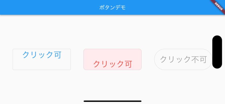
上記画面のOutlinedButtonのサンプルコードは以下の通りです。
               OutlinedButton(
                    onPressed: () {},
                    child: Text("クリック可"),
                    style: TextButton.styleFrom(
                      textStyle: const TextStyle(fontSize: 30),
                      foregroundColor: Colors.blue, // foreground
                      fixedSize: Size(220, 80),
                      alignment: Alignment.topCenter,
                    )),
                OutlinedButton(
                    onPressed: () {
                      print('赤クリック!');
                    },
                    child: Text("クリック可"),
                    style: TextButton.styleFrom(
                        backgroundColor: Colors.red.shade50,
                        textStyle:
                          const TextStyle(fontSize: 30, color: Colors.green),
                      foregroundColor: Colors.red,
                      // foreground
                      fixedSize: Size(220, 80),
                      alignment: Alignment.bottomCenter,
                      shape: RoundedRectangleBorder(
                        borderRadius: BorderRadius.circular(10.0),
                      ),
                    )),
                OutlinedButton(
                    onPressed: null,
                    child: Text("クリック不可"),
                    style: TextButton.styleFrom(
                      textStyle: const TextStyle(fontSize: 30),
                      foregroundColor: Colors.red, // foreground
                      fixedSize: Size(220, 80),
                      shape: StadiumBorder(),
                    )),
| プロパティ | 指定 | 内容 |
|---|---|---|
| onPressed | 必須 | ボタンクリック時の処理 |
| child | 必須 | ボタンに表示するテキスト文字を指定 |
| textStyle | 任意 | テキスト文字のサイズ指定 |
| foregroundColor | 任意 | テキスト文字の色指定 |
| fixedSize | 任意 | テキストボタンのサイズ指定(横*縦) |
| alignment | 任意 | テキスト文字の位置を指定(上中央、下中央、上左寄り、など) |
| backgroundColor | 任意 | ボタンの色を指定 |
| shape | 任意 | ボタンの外枠を指定(角丸、左右丸、など) |
Flutterの基本ボタン4つ目はIconButton です。
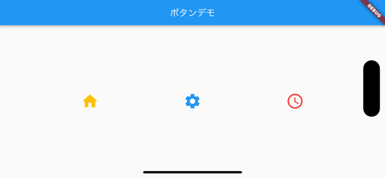
上記画面のOutlinedButtonのサンプルコードは以下の通りです。
               IconButton(
                  onPressed: () {},
                  iconSize: 40,
                  icon: Icon(Icons.home),
                  color: Colors.amber,
                ),
                IconButton(
                  onPressed: () {},
                  iconSize: 40,
                  icon: Icon(Icons.settings),
                  color: Colors.blue,
                ),
                IconButton(
                  onPressed: () {},
                  iconSize: 40,
                  icon: Icon(Icons.schedule),
                  color: Colors.red,
),| プロパティ | 指定 | 内容 |
|---|---|---|
| onPressed | 必須 | アイコンクリック時の処理 |
| icon | 必須 | 表示したいアイコンを指定 |
| iconSize | 任意 | アイコンのサイズ指定 |
| color | 任意 | アイコンの色を指定 |
Flutterの基本ボタン5つ目はFloatingActionButton です。画面下に配置するボタンです。
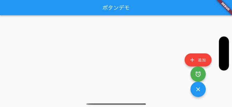
上記画面のFloatingActionButton のサンプルコードは以下の通りです。
            FloatingActionButton.extended(
              backgroundColor: Colors.red,
              onPressed: () {},
              label: const Text('追加'),
              icon: Icon(Icons.add),
            ),
            FloatingActionButton(
              backgroundColor: Colors.green,
              onPressed: null,
              child: Icon(Icons.access_alarms),

            ),
            FloatingActionButton(
              onPressed: () {},
              child: Icon(Icons.close),
            ),
],| プロパティ | 指定 | 内容 |
|---|---|---|
| onPressed | 必須 | ボタンクリック時の処理 |
| child | 必須 | ボタンに表示するアイコンを指定 |
| label | 任意 | 表示したいテキスト文字を指定 |
上記が画像のサンプルコードです。そのまま使えますのでご利用ください。
import 'package:flutter/material.dart';

void main() => runApp(ButtonDemo());

class ButtonDemo extends StatelessWidget {
  @override
  Widget build(BuildContext context) {
    return MaterialApp(
      home: Scaffold(
        appBar: AppBar(title: Text('ボタンデモ')),
        body: Column(
          mainAxisAlignment: MainAxisAlignment.spaceEvenly,
          children: [
            Row(
              mainAxisAlignment: MainAxisAlignment.spaceEvenly,
              children: <Widget>[
                TextButton(
                  onPressed: () {},
                  child: Text('TextButton'),
                ),
                ElevatedButton(
                  onPressed: () {},
                  child: Text('ElevatedButton'),
                ),
                OutlinedButton(
                  onPressed: () {},
                  child: Text('OutlinedButton'),
                ),
              ],
            ),
            Row(
              mainAxisAlignment: MainAxisAlignment.spaceEvenly,
              children: <Widget>[
                IconButton(
                  onPressed: () {},
                  iconSize: 40,
                  icon: Icon(Icons.home),
                ),
                IconButton(
                  iconSize: 40,
                  onPressed: () {},
                  icon: Icon(Icons.settings),
                ),
                IconButton(
                  iconSize: 40,
                  onPressed: () {},
                  icon: Icon(Icons.schedule),
                ),
              ],
            ),
            Row(
              mainAxisAlignment: MainAxisAlignment.spaceEvenly,
              children: <Widget>[
                TextButton.icon(
                  onPressed: () {},
                  icon: Icon(Icons.home),
                  label: Text('ホーム'),
                ),
                ElevatedButton.icon(
                  onPressed: () {},
                  icon: Icon(Icons.settings),
                  label: Text('設定'),
                ),
                OutlinedButton.icon(
                  onPressed: () {},
                  icon: Icon(Icons.calendar_month),
                  label: Text('カレンダー'),
                ),
              ],
            ),
          ],
        ),
        floatingActionButton: FloatingActionButton(
          onPressed: () {},
          child: Icon(Icons.add),
        ),
      ),
    );
  }
}今回の記事では、Flutterのボタンにおける基本的な使い方をサンプルコードとアプリ画面で解説しました。
Flutterで知っておくべきボタン
Flutterエンジニアになるには?
初心者が中級者レベルのFlutterエンジニアなるまでの進め方をまとめました。
Flutterの学習方法を知る
Flutter をスクールで学ぶ
Flutterの副業を探す
おまけ:Flutter入門の完全ガイド
Flutter/Dartの基礎一覧
Flutter/Dartの入門知識として押さえておきたい内容をまとめました。学習のご参考にどうぞ。


コメント